All your Logistic digitized.
TNT Digital
TNT Express offers door-to-door shipping to more than 200 countries—connecting people and businesses all over the world.
2015-17
Product designer
TNT/Fedex
Jungleminds
The challenge
A digital landscape made out of many outdated tools and platforms for businesses to ship their goods based on their needs, locations or segments.
In order to address this issue, TNT started up its official digital department in Hoofddorp (NL) in 2015, gathering several teams of talented managers, designers and developers. I joined the UX team to work on the booking and the tracking parts of a new unified platform.

The process
In order to unify the different B2B shipping services in place, we had to analyze the very specific needs and features present in each tool and create a consistent and harmonious User interface that would ease the shipping process for each target group.
Mapping the situation
To connect the dots between each digital product on the market, we mapped the many existing flows and funnels, and aligned with the brand guidelines available.

Competitors analysis
We analysed what the main competitors were doing in order to compare and learn how to improve and align on market standards.

A day with the driver
There is nothing like going on the battlefield and see the challenges that customers and delivery agents are facing on a day-to-day basis. I had the chance to follow a TNT driver for a full day and learn from the pros.

Design iterations & presentations
After defining the main pain points we had brainstorm sessions on how to tackle each challenge and iterate on UX improvements. We presented our progress to the different stakeholders on a weekly basis, making sure that the designed solutions would meet the users and business expectations.


User tests in London
I travelled to London (UK) for a full day of testing with end users, comparing our new prototype to the older TNT booking flow in order to learn and validate the design improvements.


The solution
myTNT. One global online platform giving access to the TNT delivery services with a better unified responsive interface.

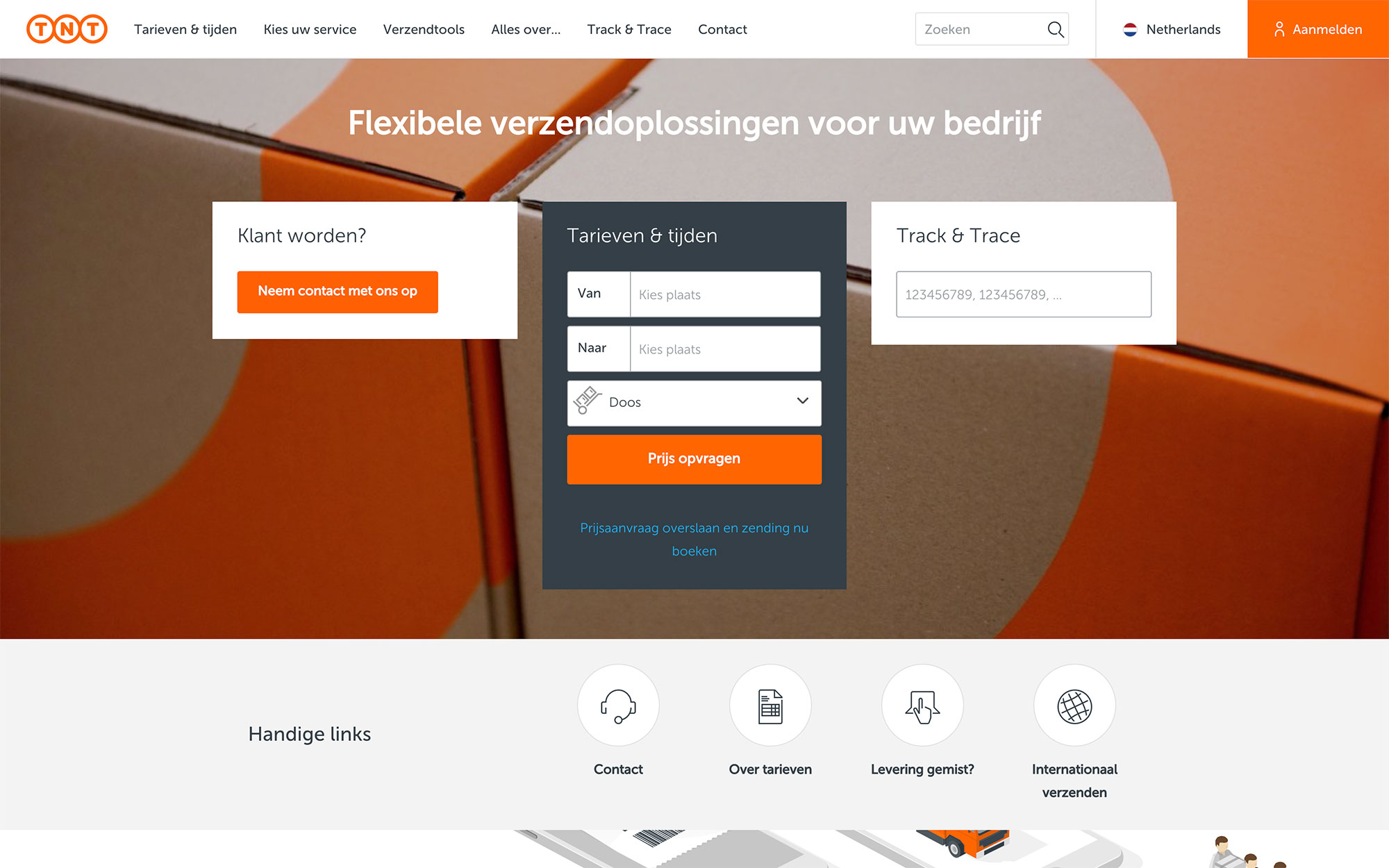
Quote widget
The quote widget on the TNT homepage helps professionals quickly get a price based on the origin, destination and type of package they want to ship. They also get tips and handy advises about how to prepare their shipment and customs documentation.
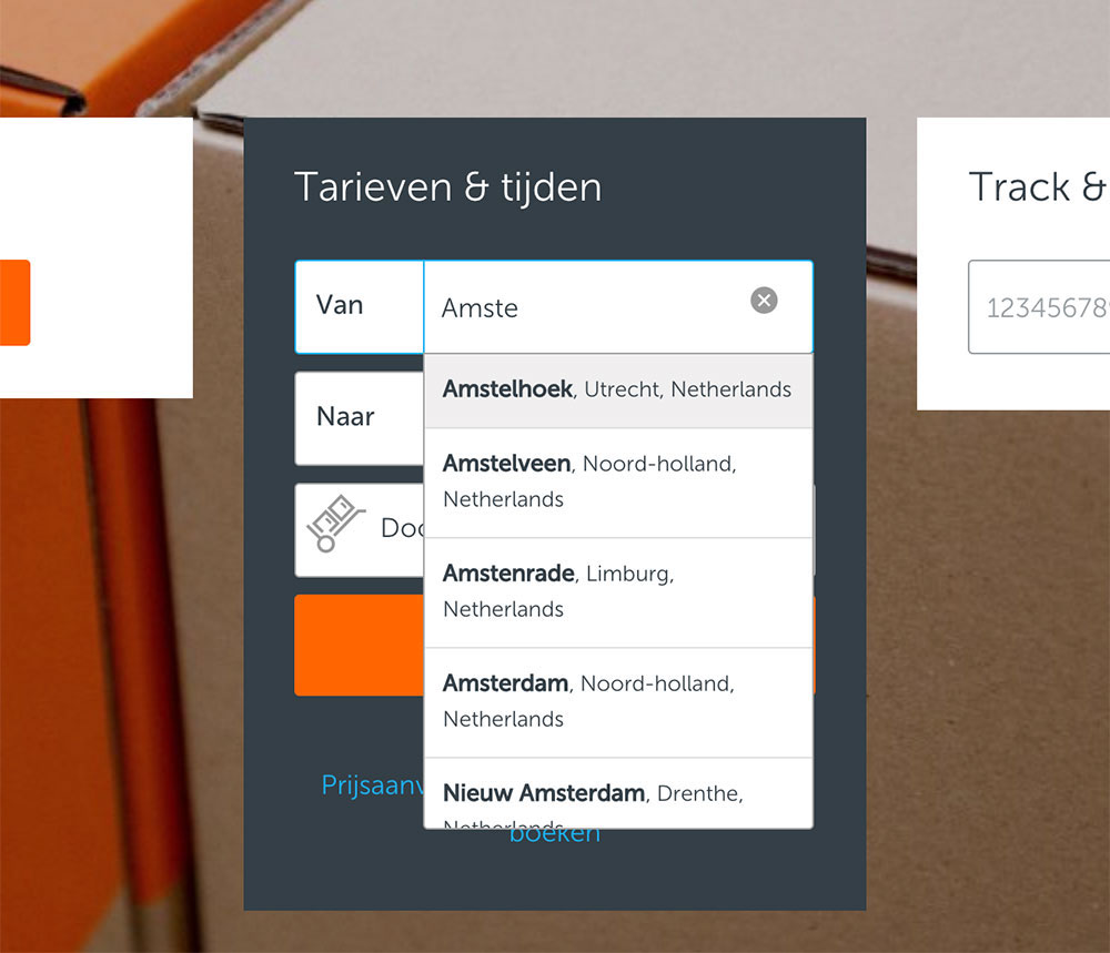
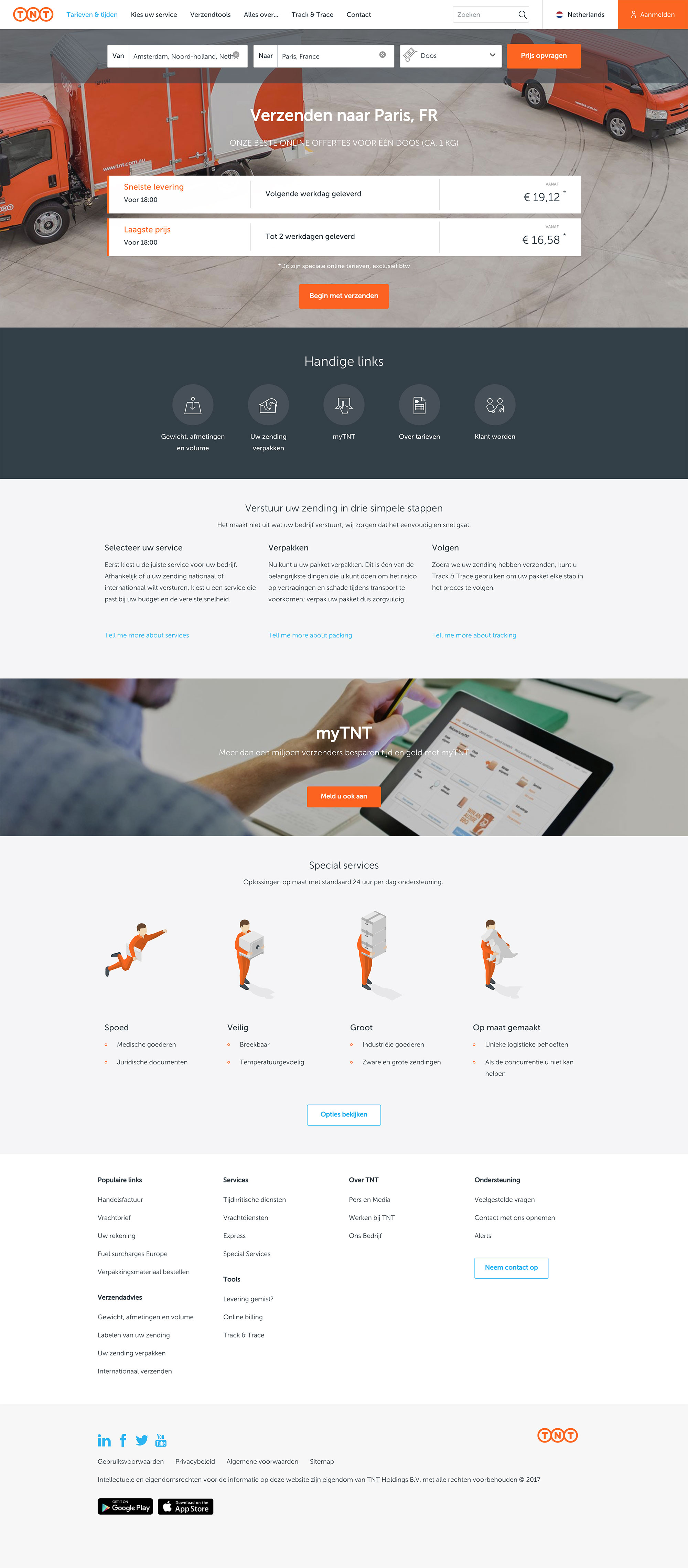
MyTNT Booking tool
The user can then enter the myTNT booking form and add all details to ship his goods. The new myTNT also features great functionalities such as shipments overview, address book, templates and live chat support.

Track & Trace
The Track & Trace module helps receivers keep an eye on their delivery status and the details of the delivery process.

After spending 2 years working on optimizing the first and last miles in the customer journey, I started working on the interaction patterns for the new TNT design system.


I also worked on flows, prototypes and concepts together with the all UX team to be tested and validated with users before implementation.

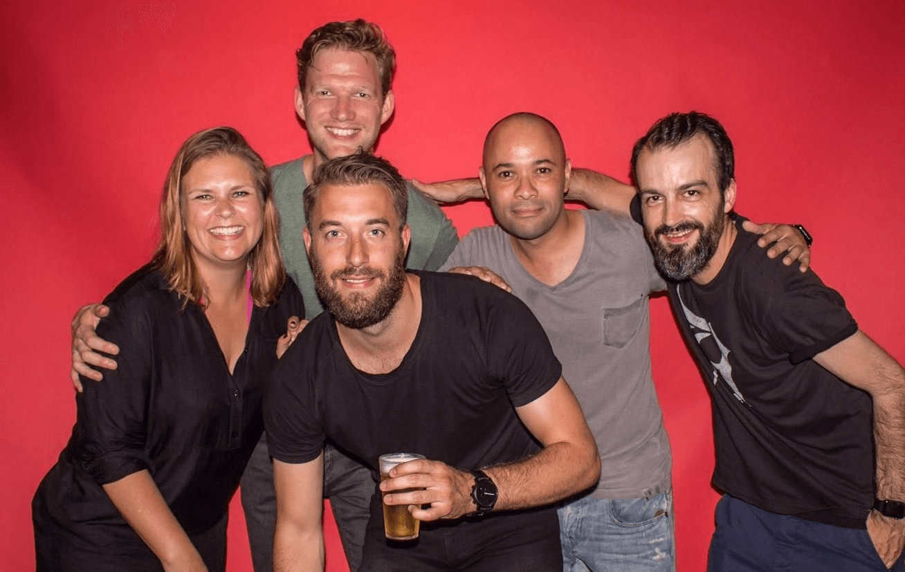
The team


Up next


 Designforthem