 Designforthem
Digital banking with a human touch.
Design system

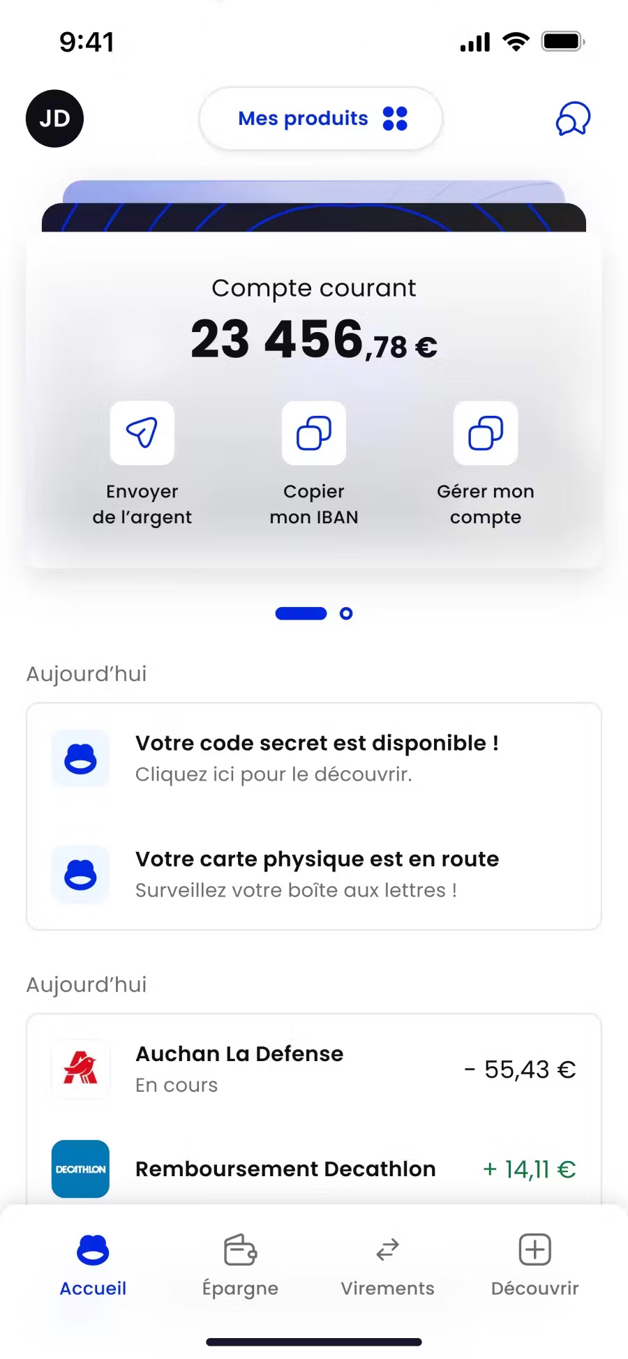
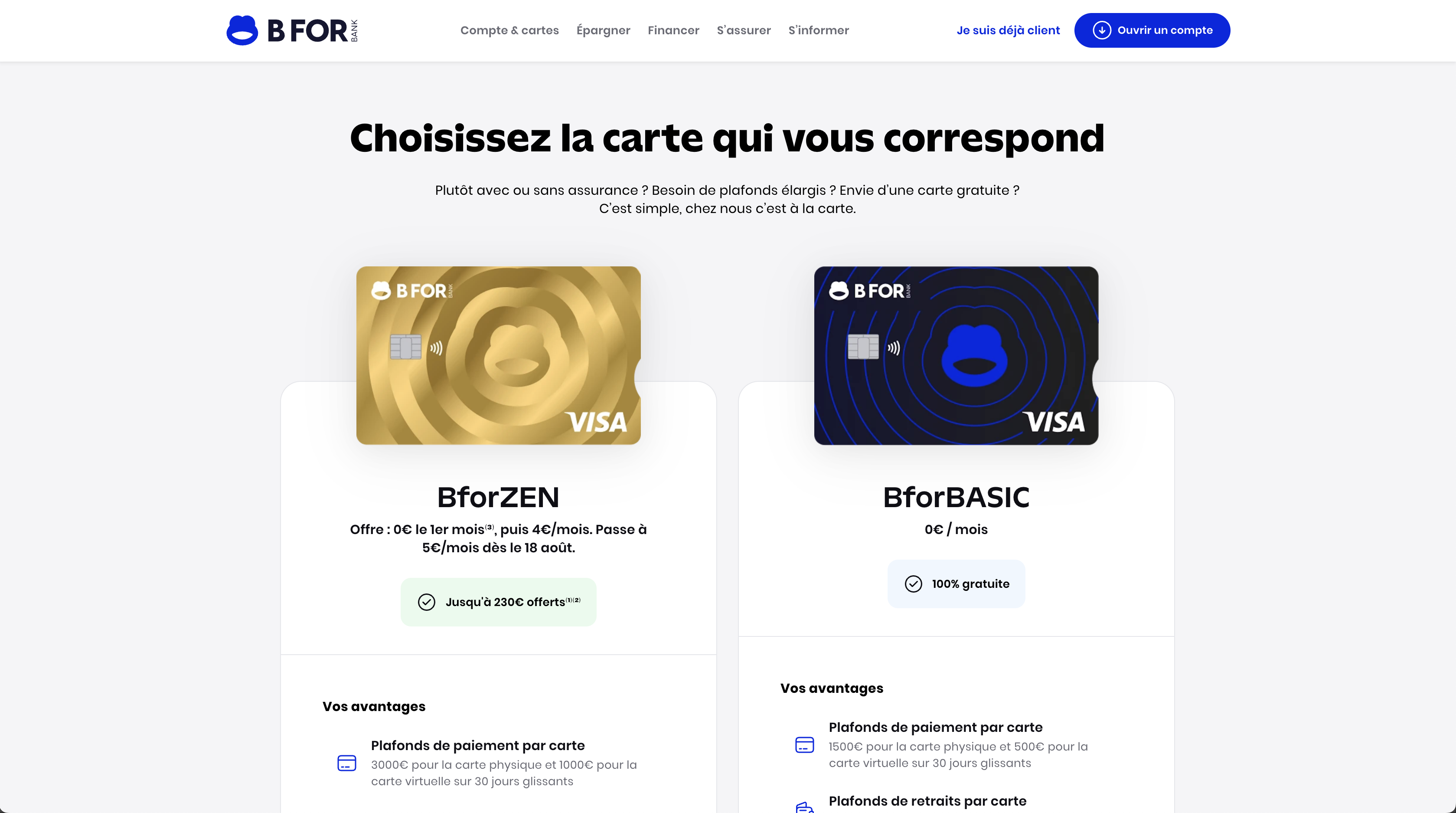
BforBank is an online bank launched in October 2009 by the Crédit Agricole regional banks. BforBank offers day-to-day banking, savings, investment, and credit (consumer and real estate) services.
2022-24
Lead Design system
Design Ops
BforBank
Designit
The challenge
In June 2022, BforBank began a full-scale transformation of its visual identity and digital products. To support this shift, I joined the team as Lead Design System via Designit Madrid, with the goal of building a scalable system that would unify design, development, and content teams across all touchpoints.
The transformation wasn't just visual. It required rethinking how teams worked, how components were built, how content was written, and how everything would stay aligned as the product scaled. The challenge was to create not just assets, but a structure that could guide, evolve, and support all teams involved.

The process
I started by defining a clear governance model for the design system, outlining roles, ownership, and decision-making processes to ensure accountability and consistency. To build momentum, I ran workshops and internal sessions to involve teams early and encourage contributions.
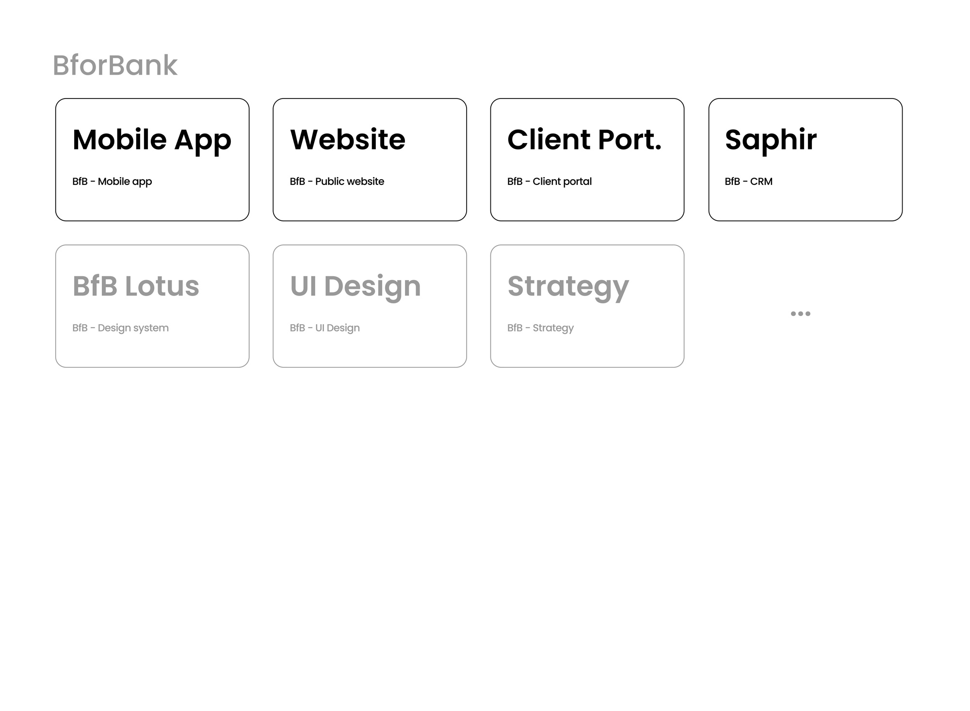
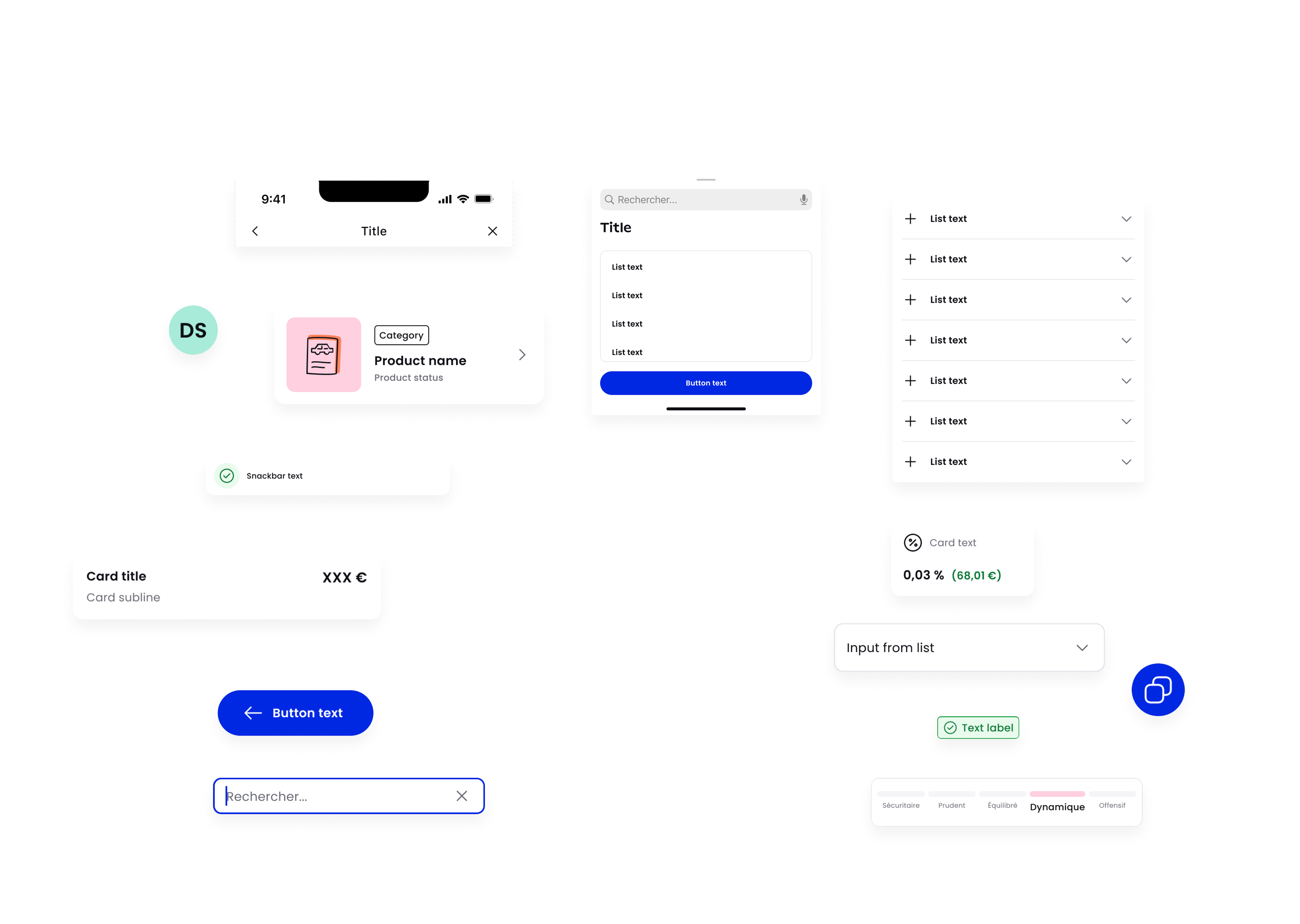
Figma architecture
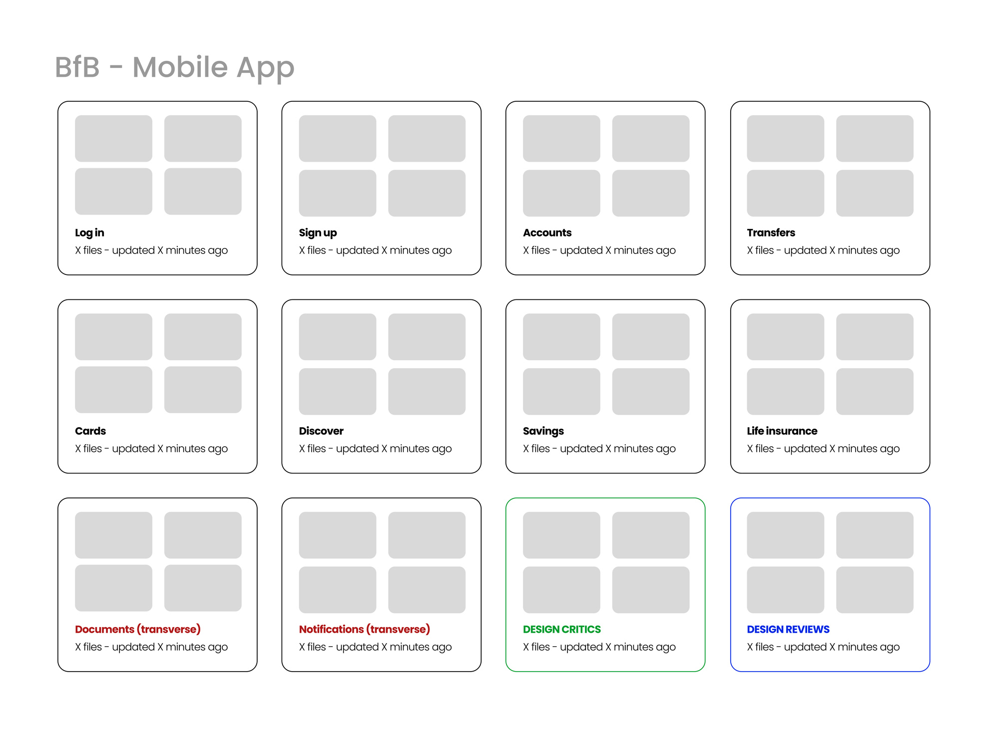
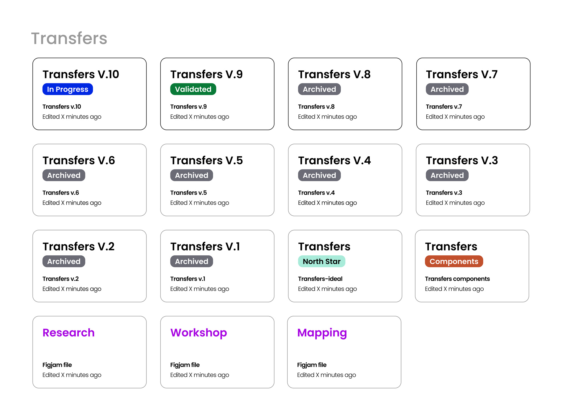
To bring clarity and consistency to our Figma workspace, I restructured the file architecture around a product-based approach. Each product, website, mobile app, client portal, had its own set of files, further organized by feature or section (like sign up, log in, accounts, transfers). Within each section, files were clearly labeled by status: in progress, validated, or archived. This structure made it much easier for developers and stakeholders to navigate, find up-to-date designs, and understand the status of each flow at a glance.
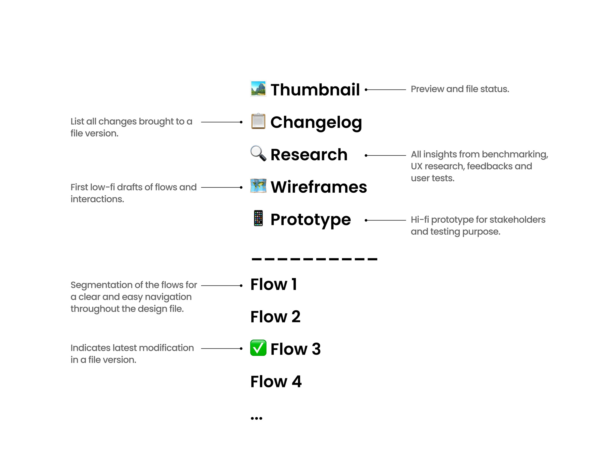
Files structure
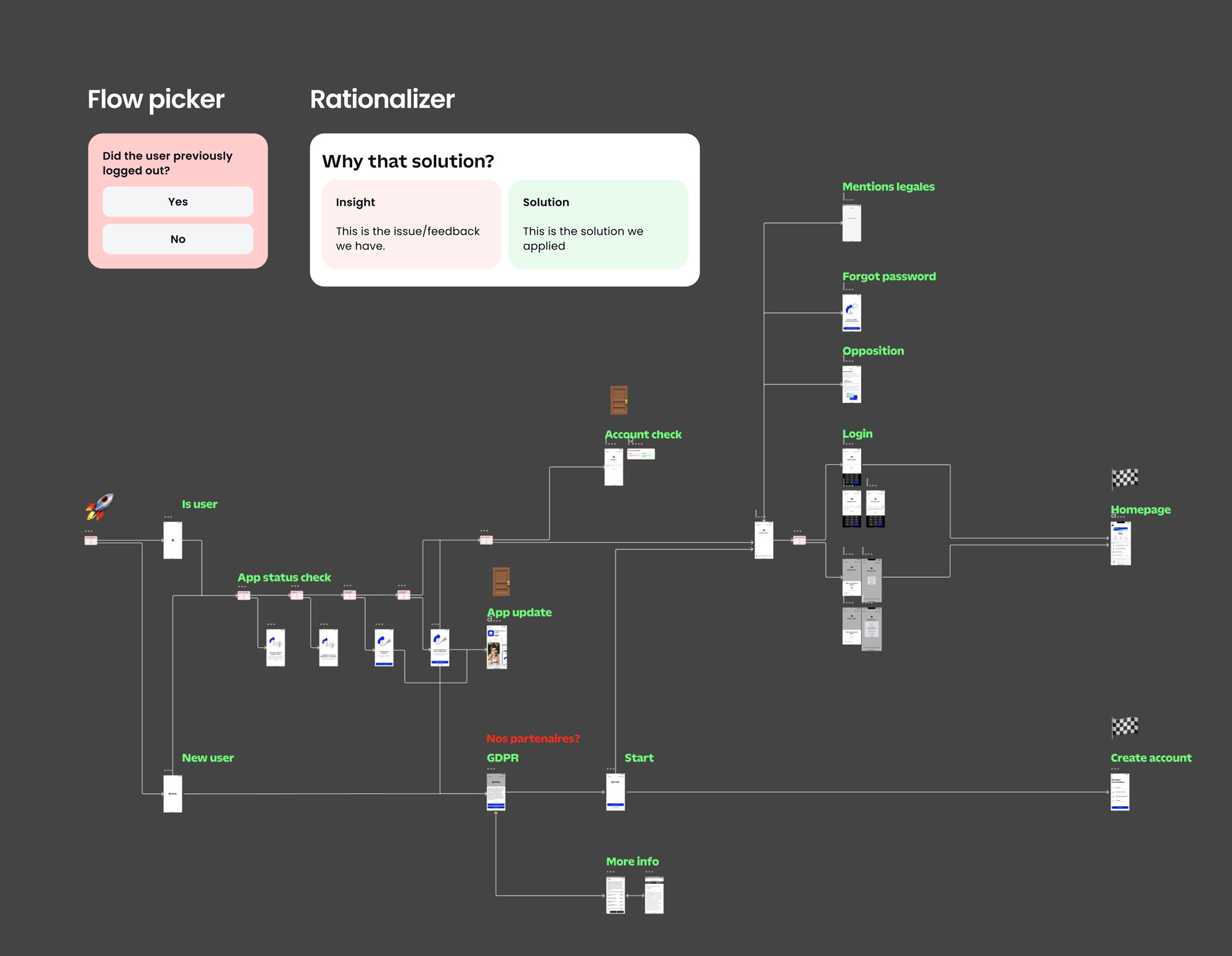
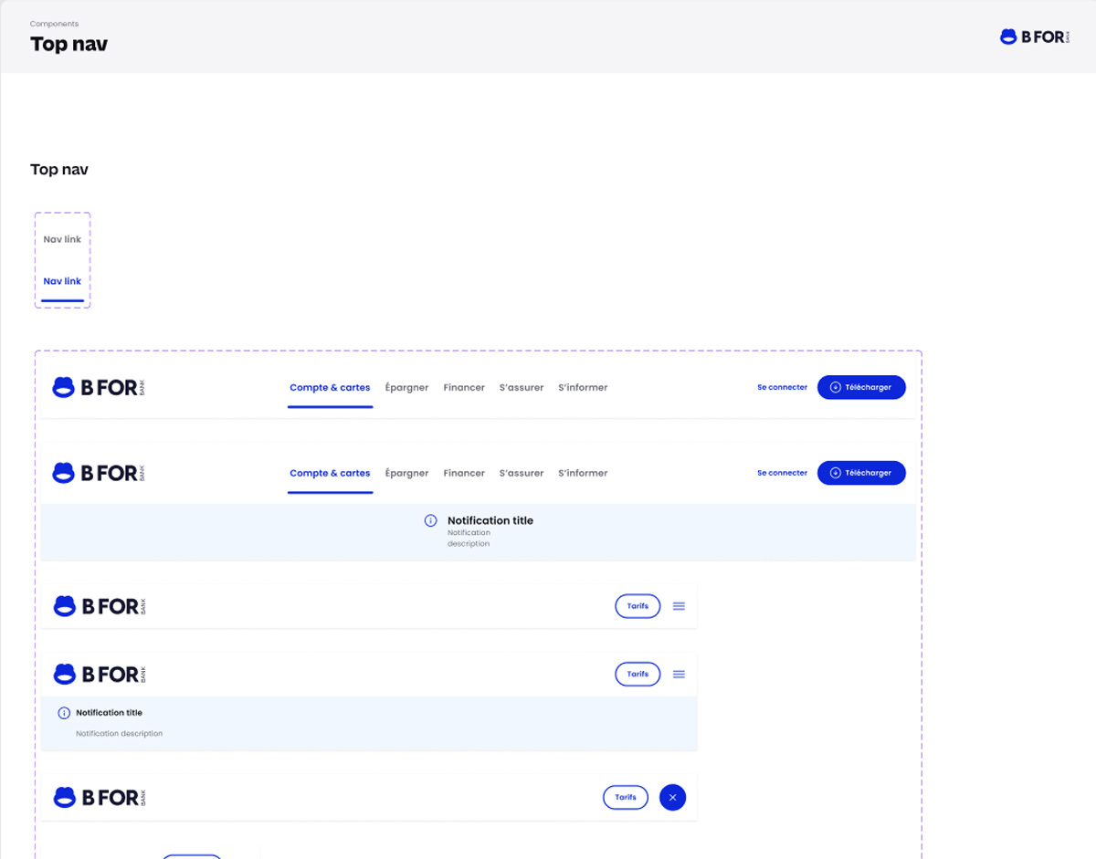
To improve readability and navigation for stakeholders in Figma, I aligned all designers on a consistent file structure and organization system. I introduced clear guidelines on how to present user flows, document rationale, and use helper components to highlight key interactions and decision points. This standardized approach made it easier for anyone, from developers to product owners, to quickly grasp the purpose of a screen or flow, reducing miscommunication and improving collaboration across teams.
Collaboration
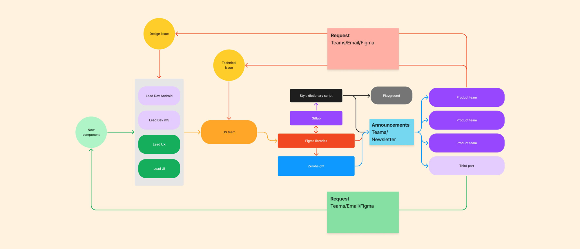
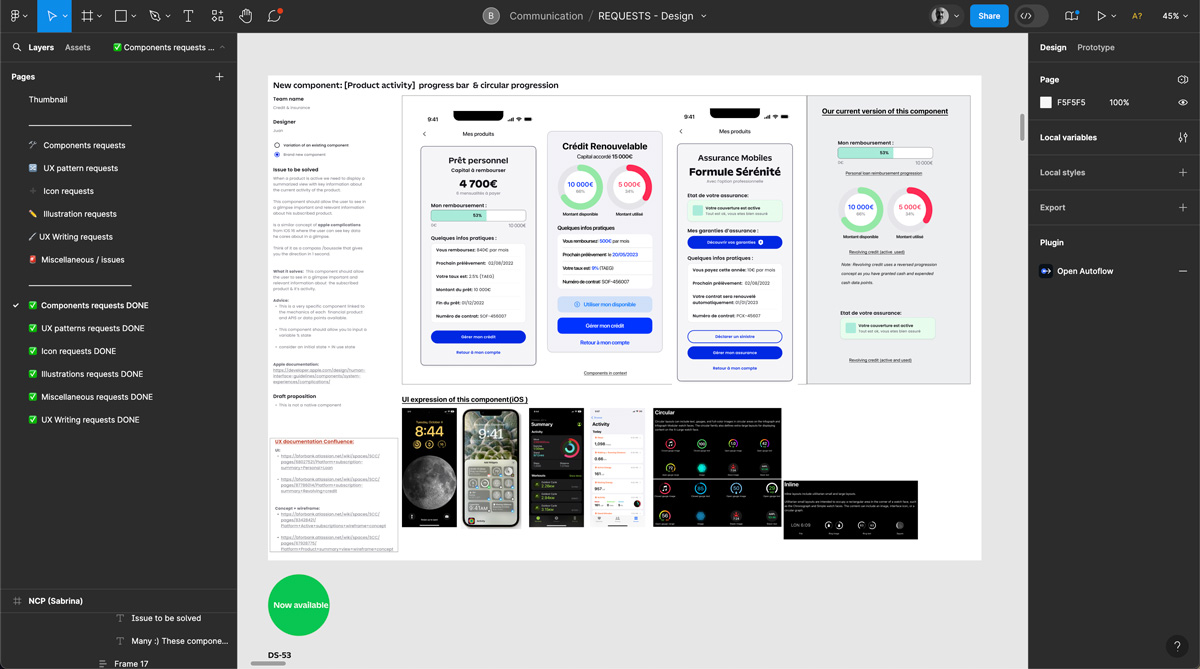
To support a collaborative and scalable system, I set up a dedicated Contribution Request file where designers could submit needs for new components, updates, icons, illustrations, or patterns. Each request included a clear rationale, context of use, and optional benchmarks or examples. This centralized file served as a discussion hub where design leads and developers could review, align on priorities, and make informed design and technical decisions before moving into production, ensuring consistency, feasibility, and shared ownership across teams.
To complement this, I also introduced regular design rituals, including design reviews, critiques, and weekly huddles, to foster open feedback, surface edge cases early, and encourage cross-silo collaboration. These moments created space for constructive discussion, alignment, and continuous improvement across the entire design team.
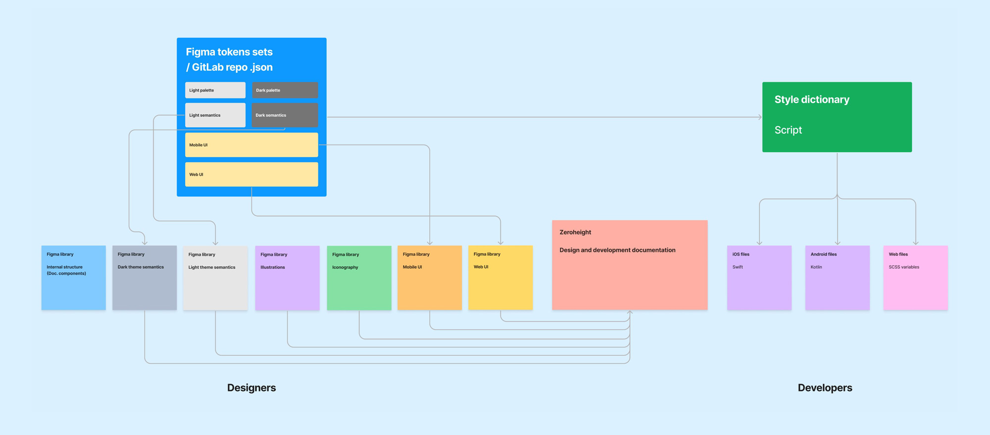
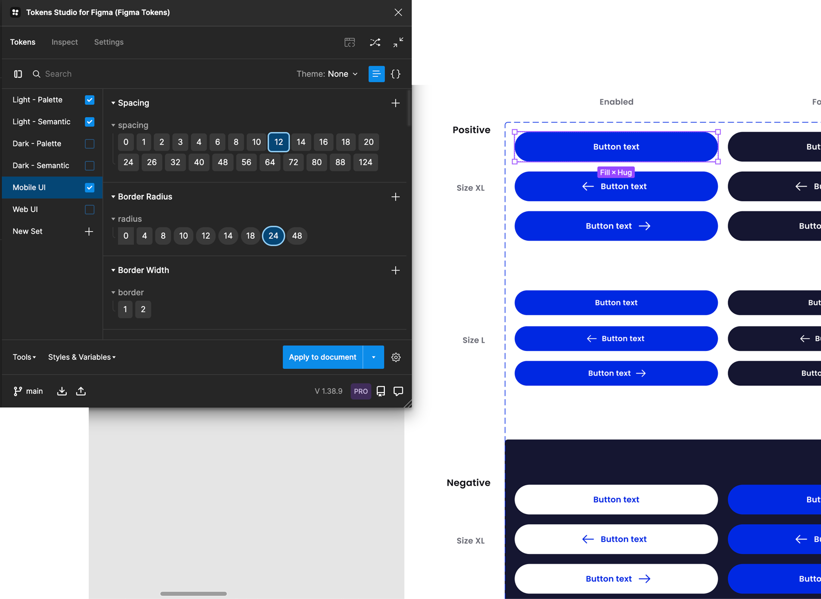
Design tokens
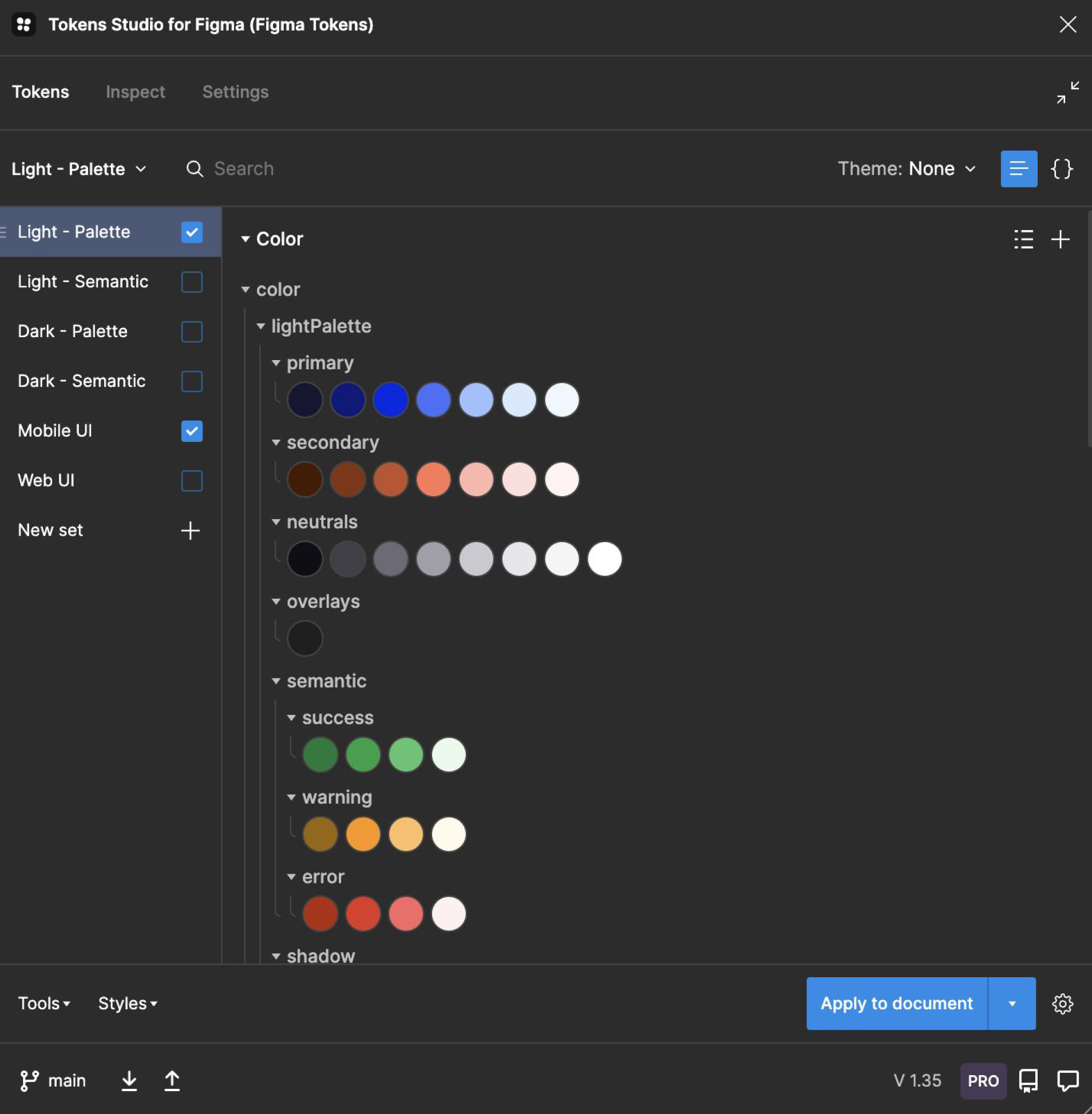
To manage design tokens efficiently across platforms, I set up a clear architecture using Token Studio, structuring tokens by theme and platform needs. These tokens were linked directly to Figma libraries to ensure consistency in UI components. For developer handoff, we exported tokens as JSON (via Gitlab) and integrated them with Style Dictionary, enabling seamless translation into native code (Swift for iOS, Kotlin for Android, and SCSS for web). The entire system was documented in Zeroheight, providing clear guidelines and token references for all teams involved.
Figma libraries
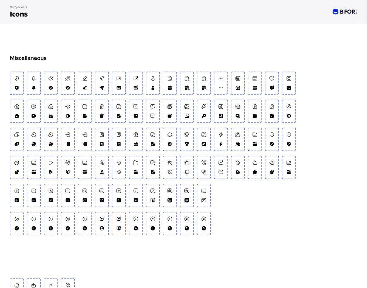
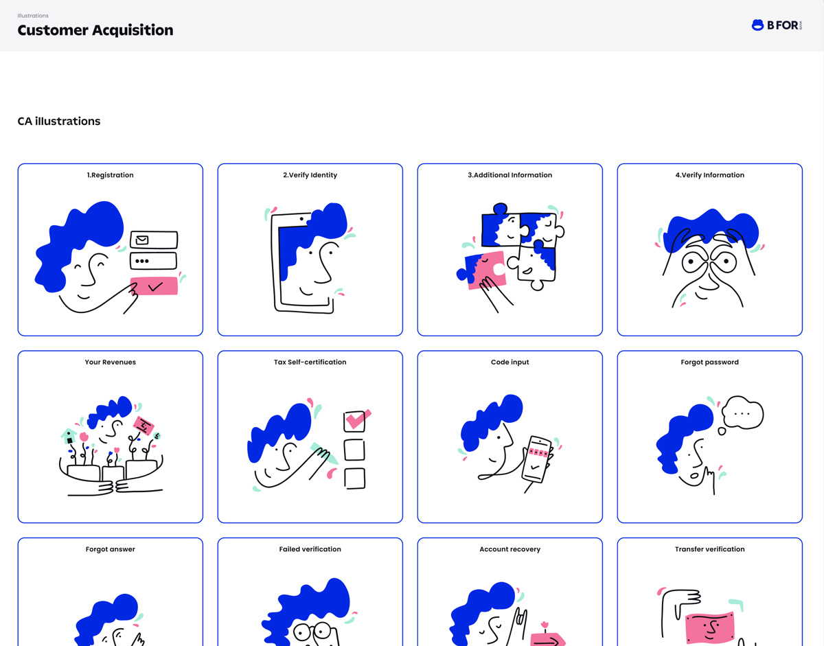
I structured the Figma libraries to be modular, scalable, and fully linked to our design tokens. Each library served a specific purpose: a base library with token-connected color palettes (including light and dark semantic themes for easy swapping), a helper file for internal Figma documentation and guidelines, and separate libraries for icons, illustrations, mobile components, and web components. This setup ensured consistency across platforms, simplified maintenance, and allowed teams to easily find and use the right assets based on their context.
Documentation
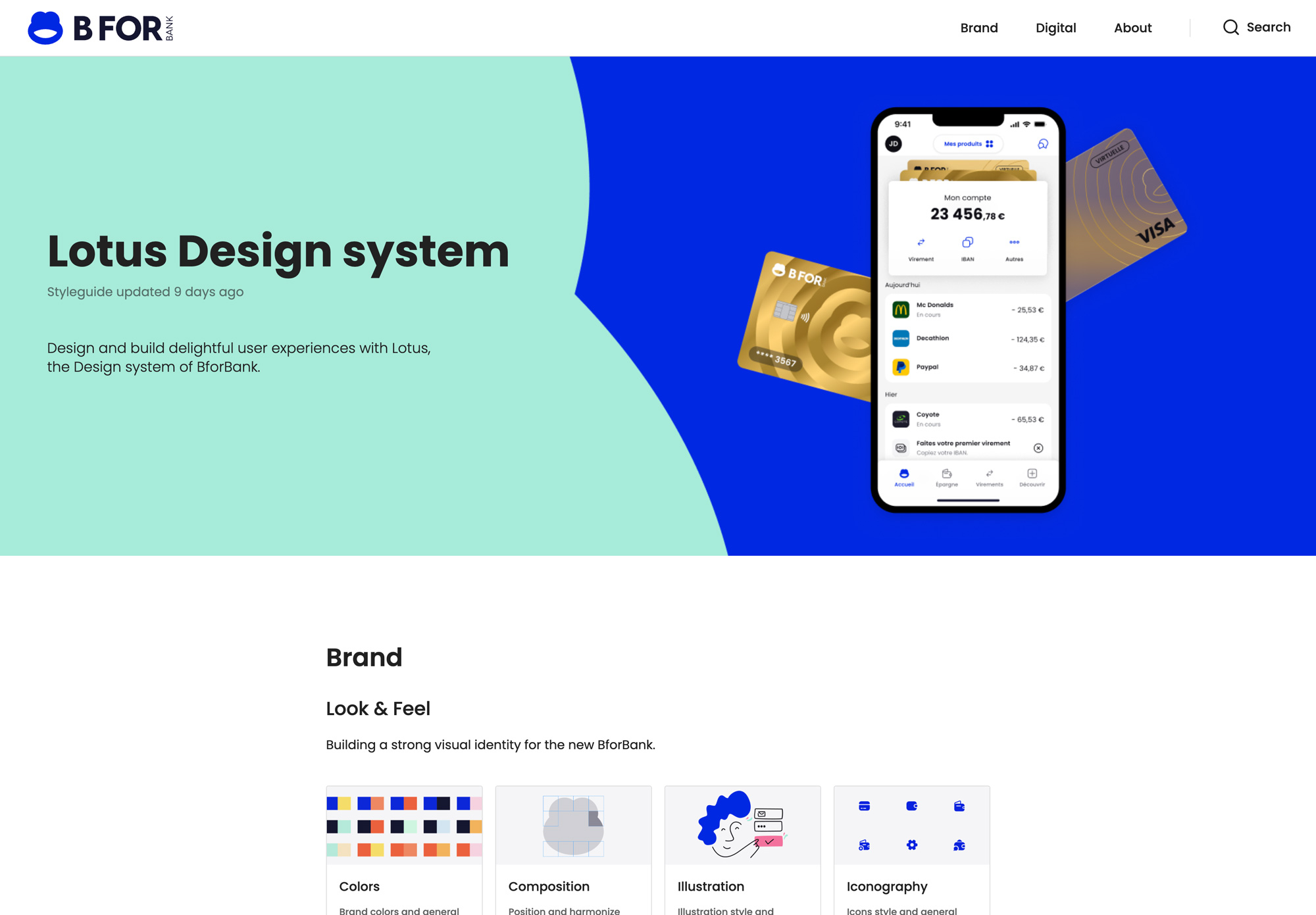
To centralize knowledge and create a single source of truth, I collaborated closely with the lead UI, UX, copywriting, branding, and development teams to build a comprehensive design system documentation hub in Zeroheight. We structured the documentation into three main sections: Brand, Digital, and About.
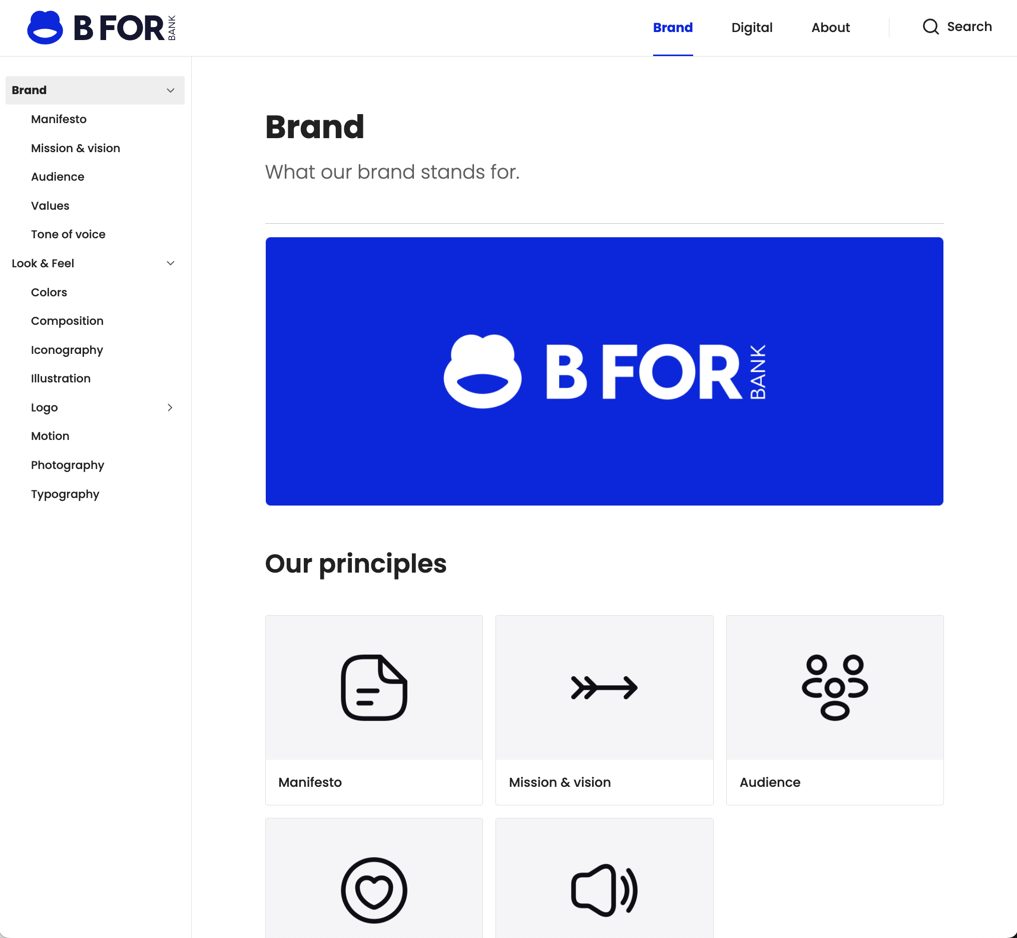
The Brand section focuses on the principles and the overall look and feel of the brand, including detailed guidelines on colors, typography, icons, photography, illustration, composition, and more, ensuring a cohesive visual language across all channels.
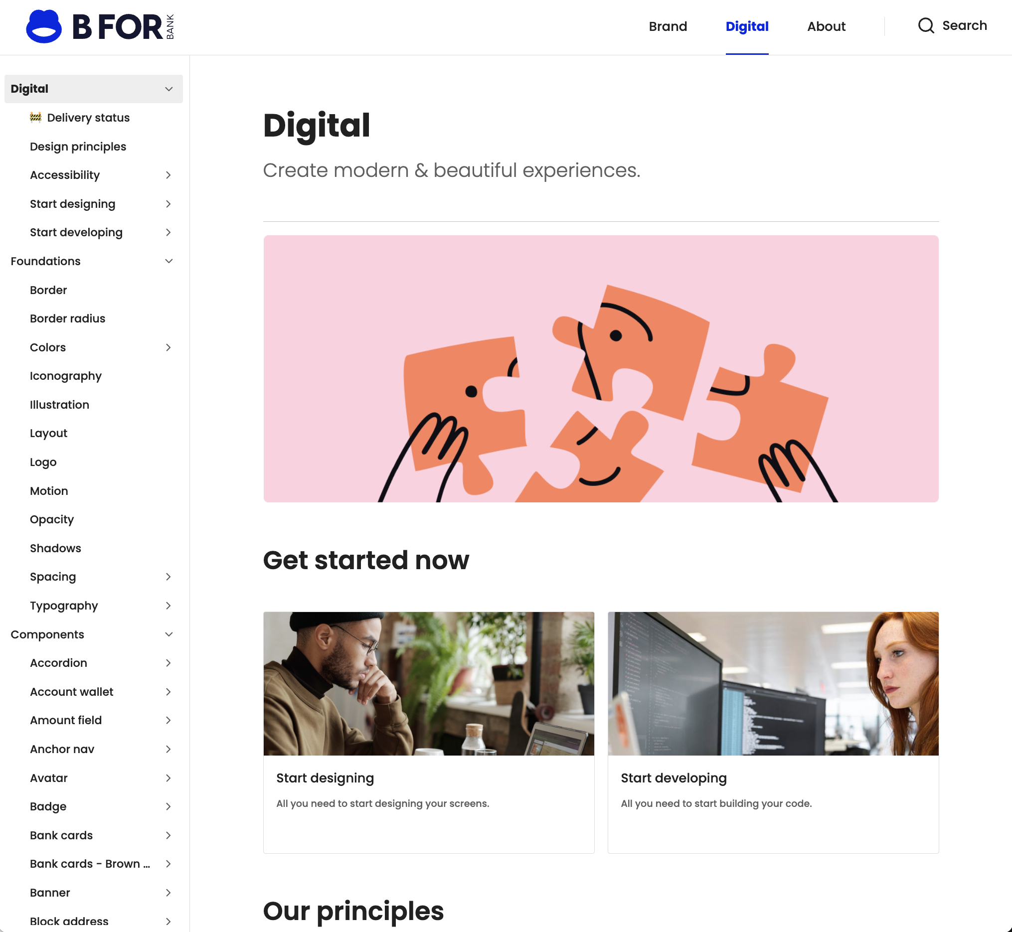
The Digital section serves as a practical resource for teams, featuring "get started" pages for designers and developers, key design and accessibility principles, core design foundations, full UI component libraries for web and mobile, and access to all visual assets.
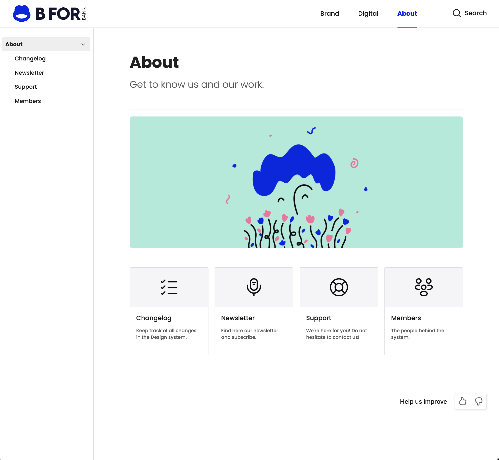
the About section offers a transparent view into the team behind the system, featuring the changelog, internal newsletter, a support page, and a space to introduce team members.
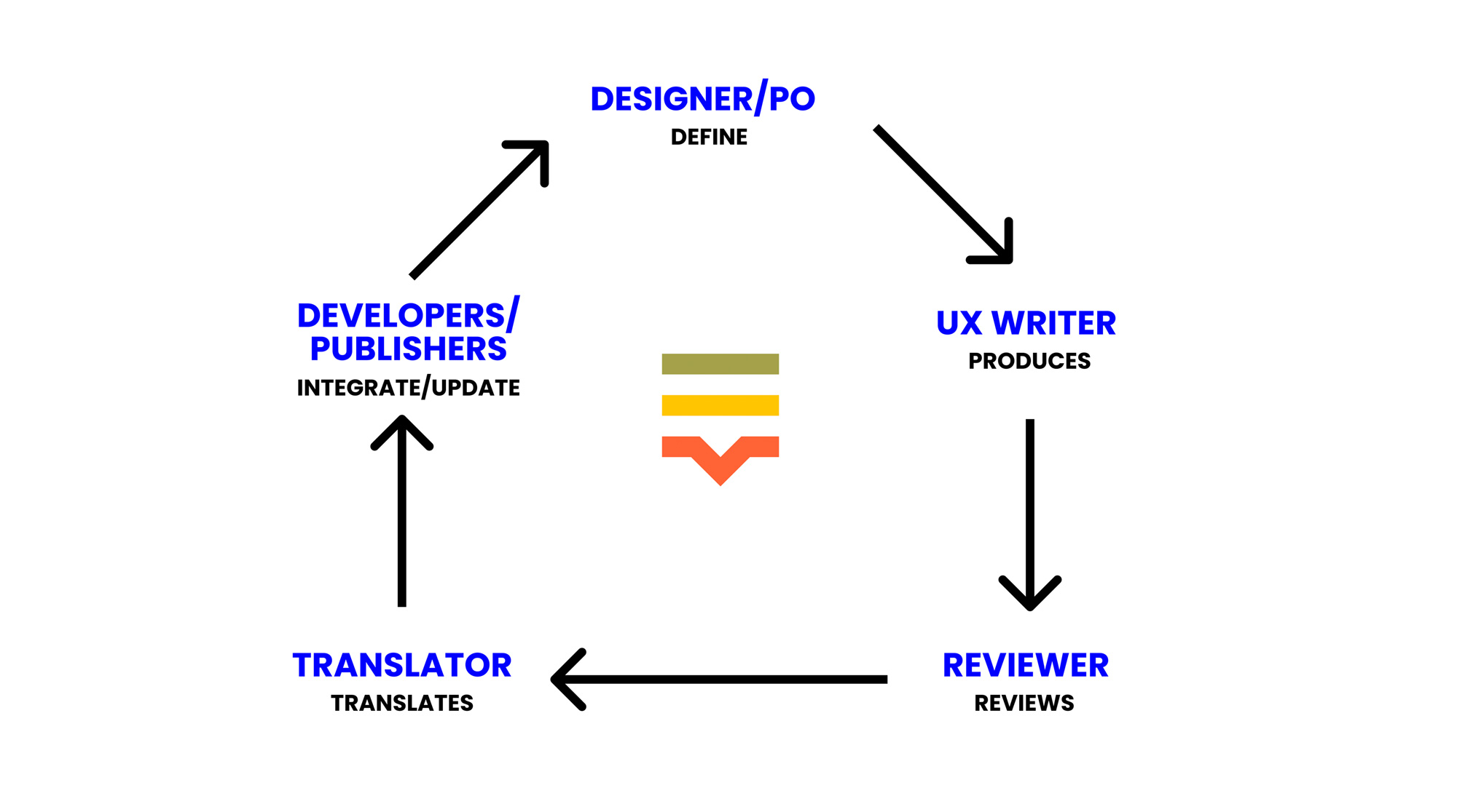
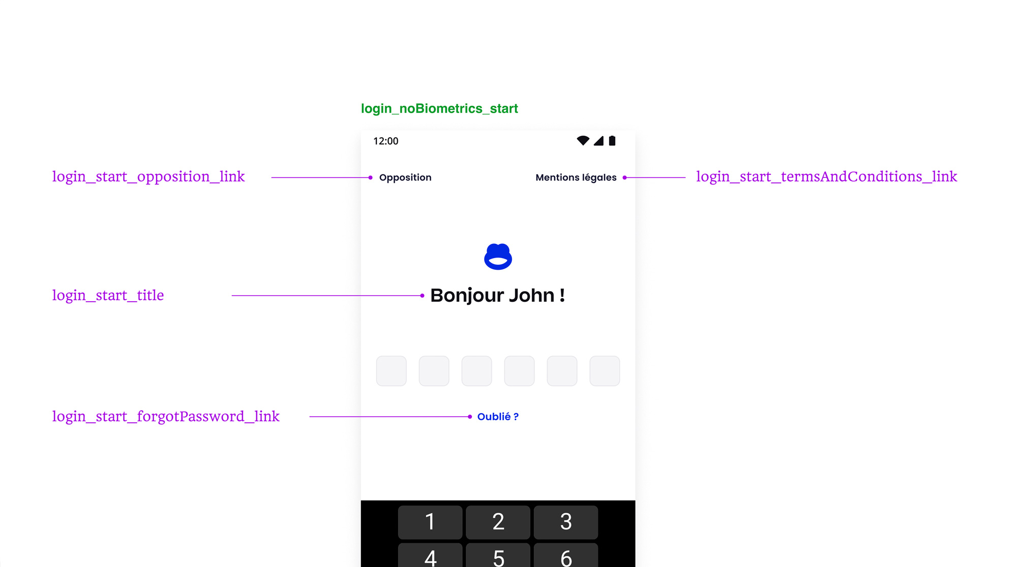
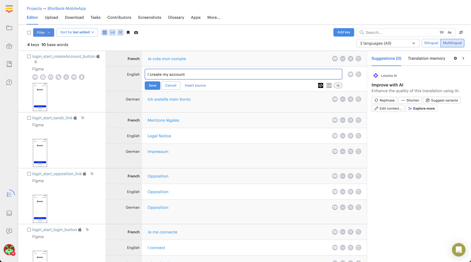
UX writing
To optimize the UX writing process, prepare the translation to different languages and ensure a consistent tone of voice across all digital products, we acquired a Lokalise license and rolled it out across design and development teams. We introduced the concept of copy keys (much like design tokens) to standardize and manage textual content efficiently. This approach made it easier to align content across screens, streamline collaboration between writers and developers, and maintain clarity and consistency as products evolved.
The solution
A unified design system where structure, clarity, and collaboration come together to build a stronger brand, ensure consistency, and accelerate delivery without friction.
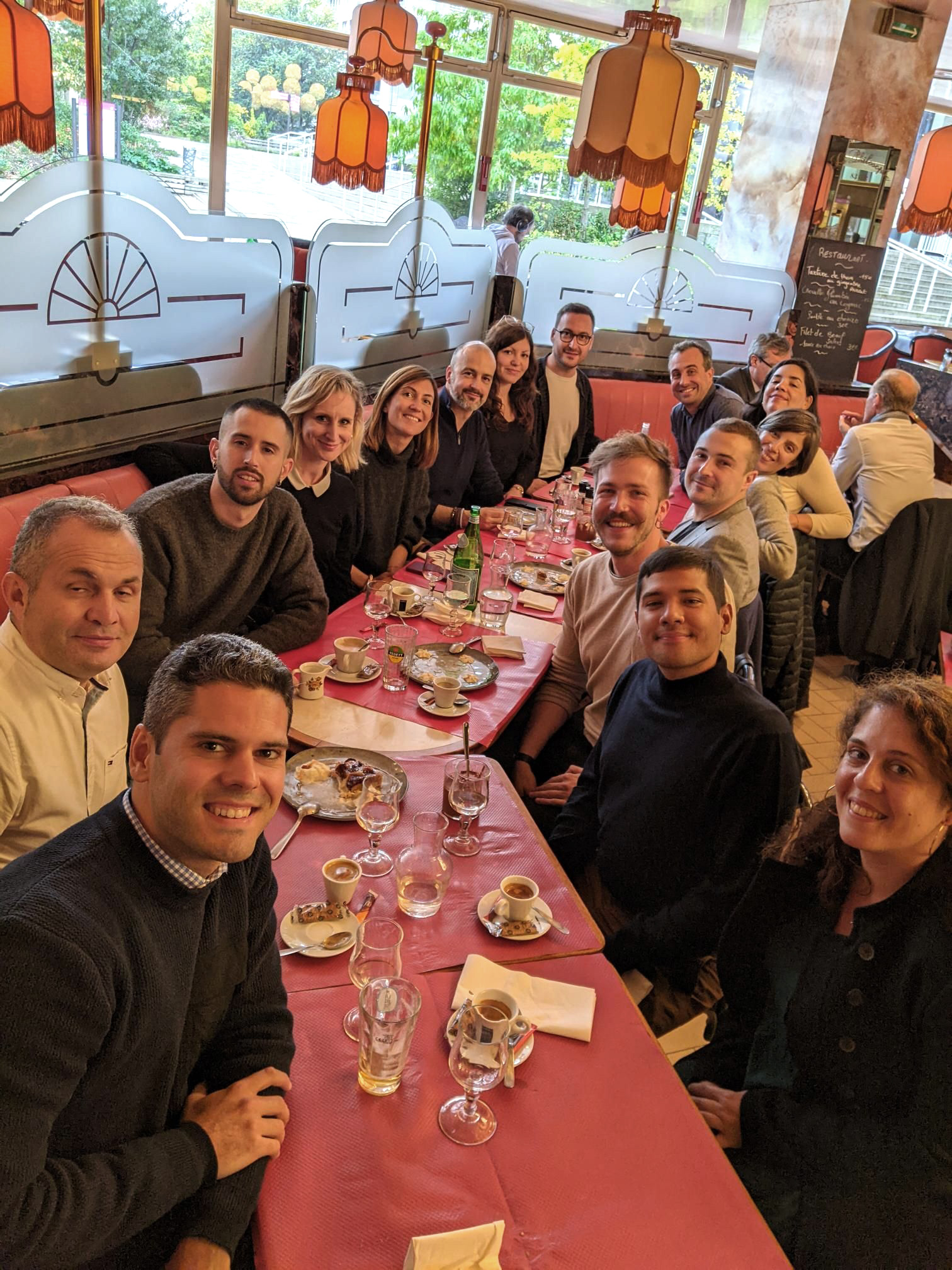
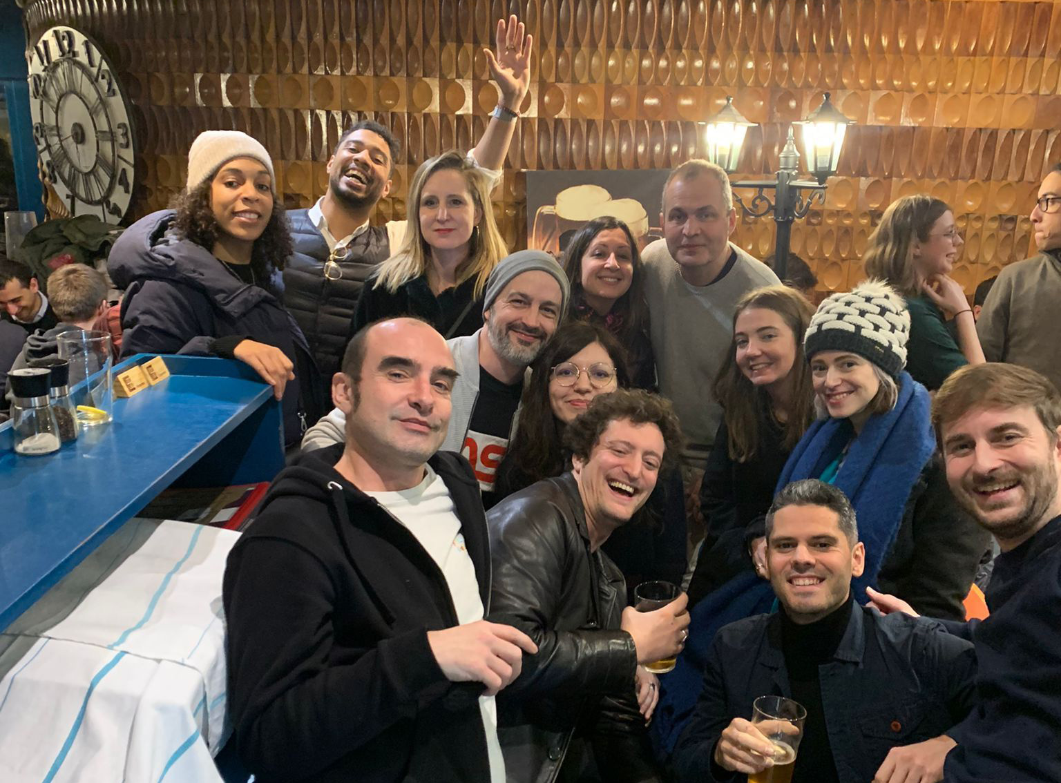
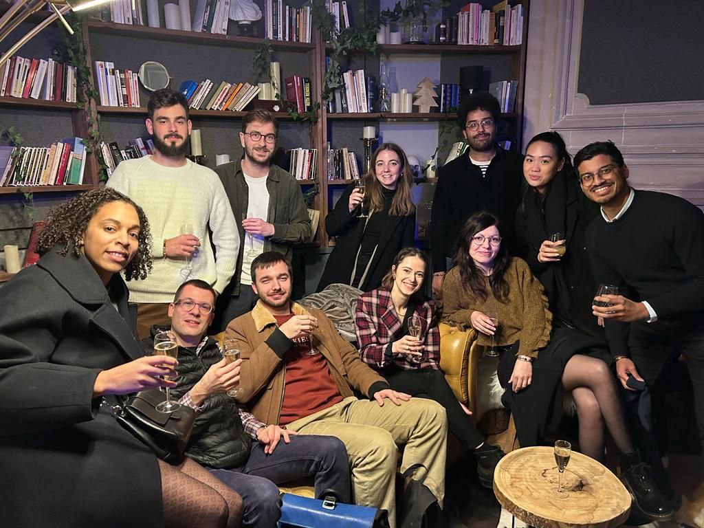
The team
Awards
Google UX Benchmark
Best customer onboarding journey

Up next
Google UX Benchmark
Best customer onboarding journey